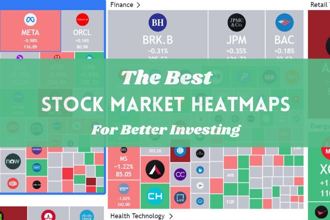
Unlock smarter trading decisions with a stocks heat map. This visual tool helps Gen Z and Millennials quickly identify market trends hot sectors and potential opportunities or risks. Understand at a glance where capital is flowing and what industries are performing best or worst. Dive into interactive charts and real time data to gain a competitive edge. Perfect for mobile users seeking instant insights into market dynamics without complex analysis. Learn how these dynamic maps can transform your investment strategy providing actionable intelligence for both short term trades and long term portfolio adjustments. Navigate market volatility with confidence using these powerful visual aids.
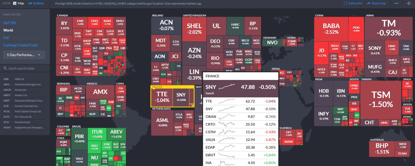
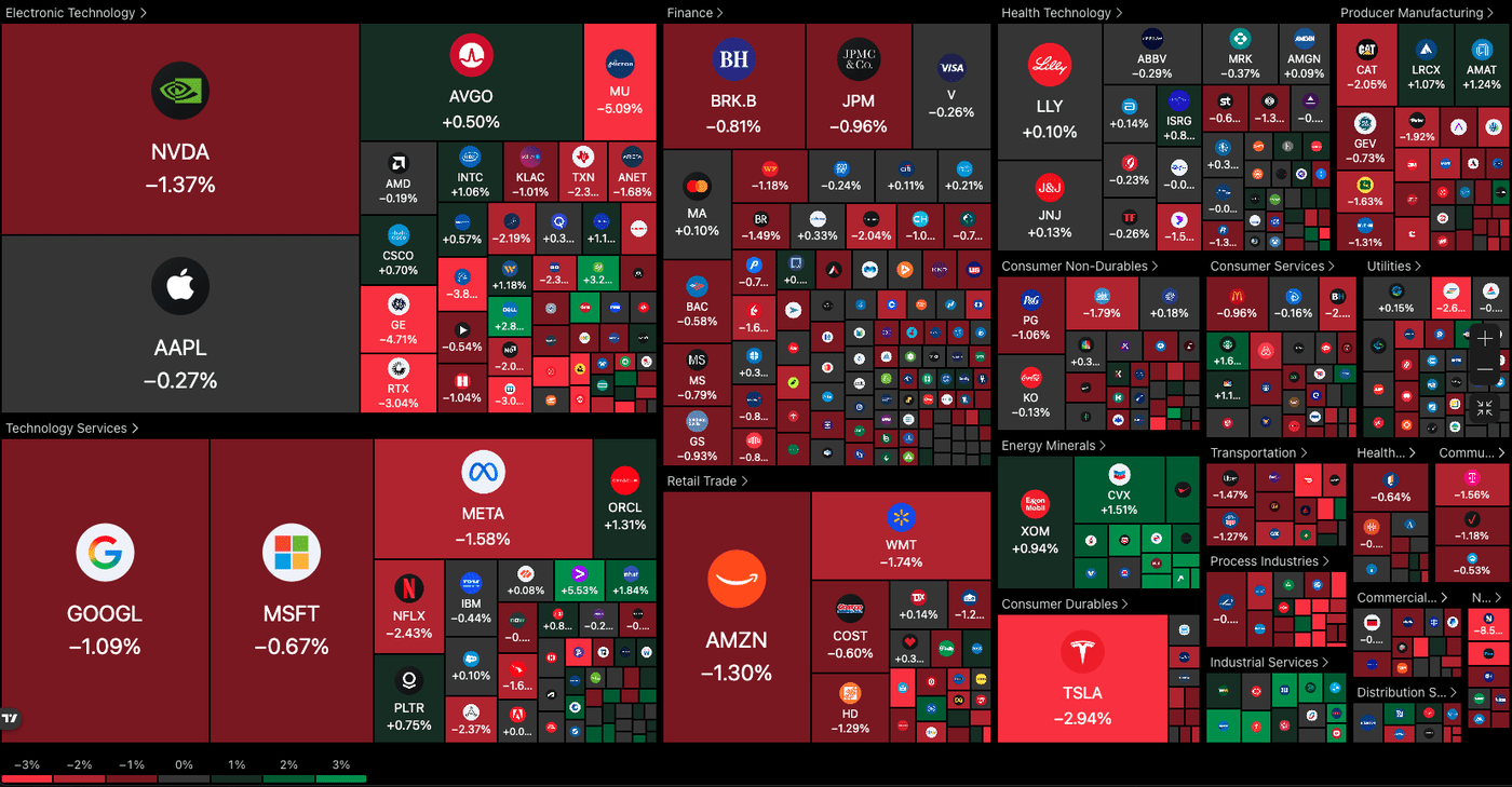
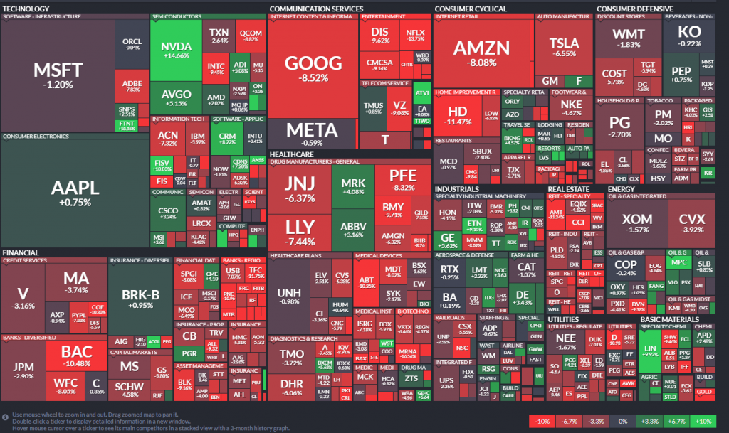
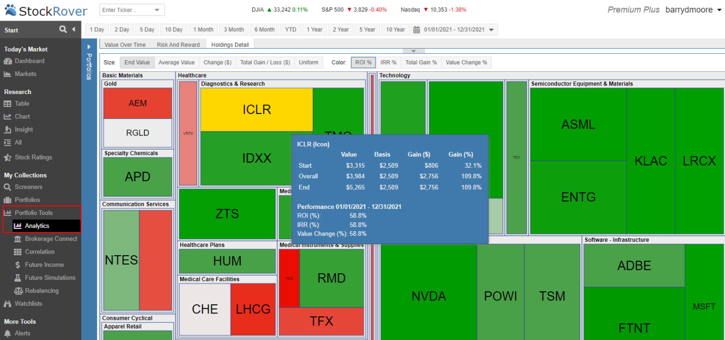
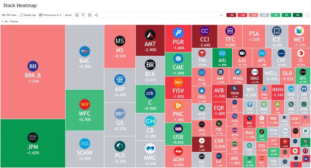
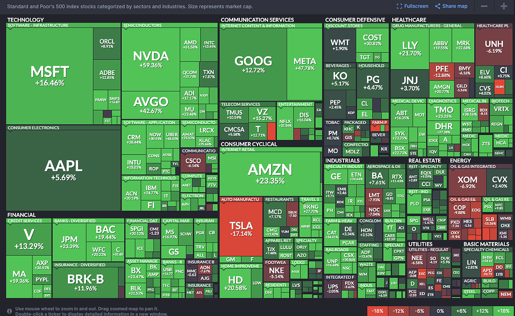
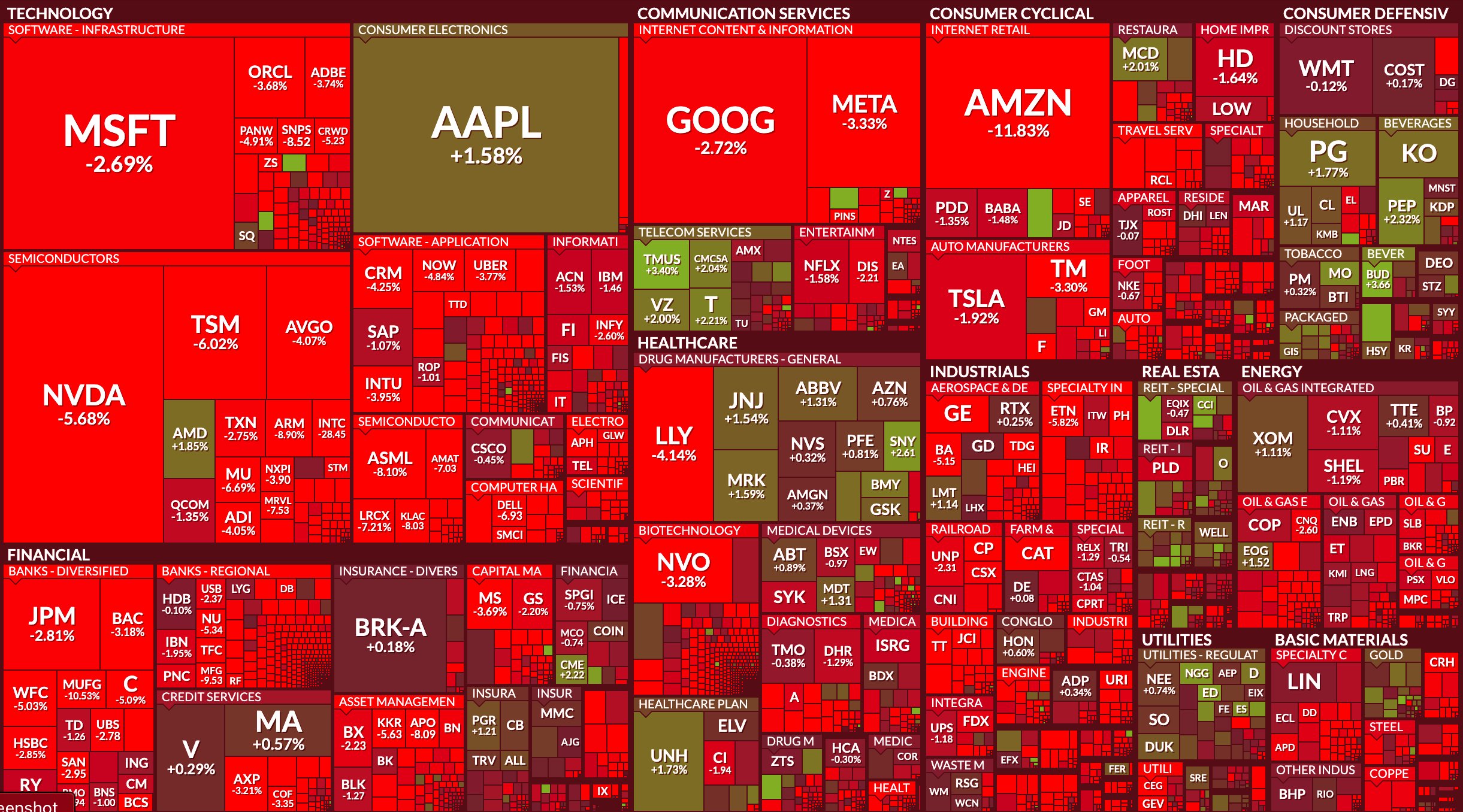
- What is a stock heat map? A stock heat map is a visual representation of the stock market, displaying market performance and sector movements using color-coded rectangles where size often indicates market capitalization and color signifies performance.
- How does a stock heat map work? It categorizes stocks by sector or industry, then colors each stock based on its price change over a specified period. Green often means gain, red means loss, with shades indicating magnitude.
- Where can I find a free stock heat map? You can find excellent free stock heat maps on websites like Finviz.com and TradingView.com. These platforms offer real-time or slightly delayed data for market overviews.
- What information does a stock heat map show? It typically shows individual stock performance, sector performance, market capitalization, daily percentage change, and can highlight strong movers or lagging areas at a glance.
- How do I read a stock heat map effectively? Look for clusters of color to identify strong or weak sectors. Larger rectangles indicate more influential companies. Use it to quickly spot trends and potential trading opportunities or risks.
- Are stock heat maps good for day trading? Yes, stock heat maps are highly beneficial for day trading. They provide rapid visual identification of market momentum and sector rotation, allowing traders to make quick, informed decisions.
- What are the best alternatives to stock heat maps for market visualization? Alternatives include sector performance charts, market breadth indicators, and customized stock screener results, though heat maps offer a unique, immediate visual summary.
Ready to level up your trading game? Forget sifting through endless numbers. Stocks heat maps are your visual superpower, giving you instant insights into market movements, hot sectors, and where the action is. This guide cuts straight to the chase for busy traders in the US, showing you how to leverage these dynamic tools for smarter decisions right from your phone.
Frequently Asked Questions
Where can I find the best stocks heat map tools?
The absolute best platforms are typically offered by Finviz, TradingView, and StockCharts. These provide robust, customizable, and real-time visual data for a comprehensive market overview.
How do I access stocks heat maps on Local MAPs or my phone?
While traditional Local MAPs apps don't host stocks heat maps, pull up your preferred mobile stock platform like Finviz.com or TradingView.com directly on your smartphone browser. Many also offer dedicated apps for seamless real-time tracking.
What are the best times to review a stocks heat map for trading?
For immediate insights, review the heat map during market open (9:30 AM EST) and close (4:00 PM EST). Daily reviews provide ongoing context. For intraday traders, check every 15-30 minutes, especially around major news releases or economic reports.
Quick Heat Map Platform Guide:
- Finviz: Market Overview, Screener
- TradingView: Charts, Community
- StockCharts: Technical Analysis, Scans
Visual market insights Real time data Sector performance overview Trend identification Risk assessment Mobile friendly trading tool
35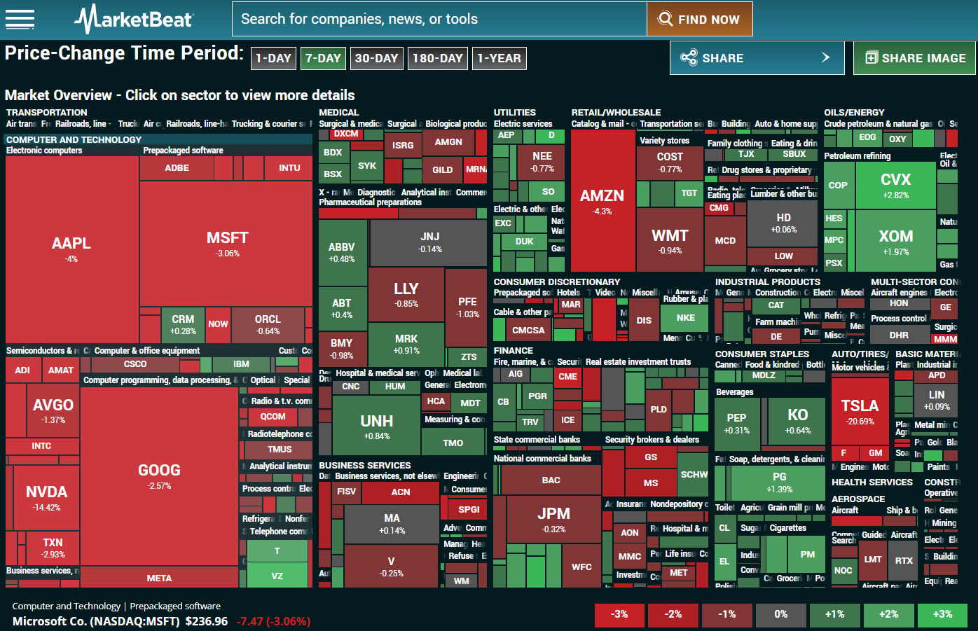

Stock Market Heat Maps Top 8 Best Free Heatmaps Tested 2026 Stock Market Heatmap Marketbeat . 7 Epic Stock FX Crypto Heatmaps For Traders Tested 2026 Stockcharts Heatmap . Stock Market Heat Maps Top 8 Best Free Heatmaps Tested 2026 Finviz Best World Stock Heatmap . Dow Jones And U S Stock Market Outlook Wall Street Gaps Down Weak Saupload Screenshot 2026 03 19 At 1400 . Heat Map Of The Universe SP 500 Map 1024x609
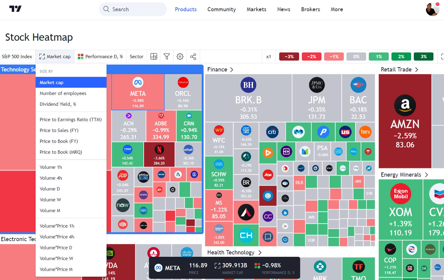

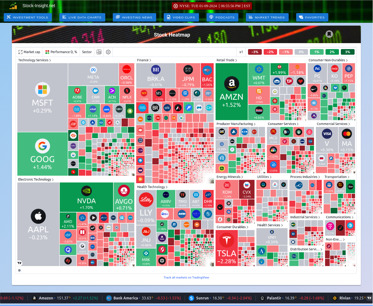
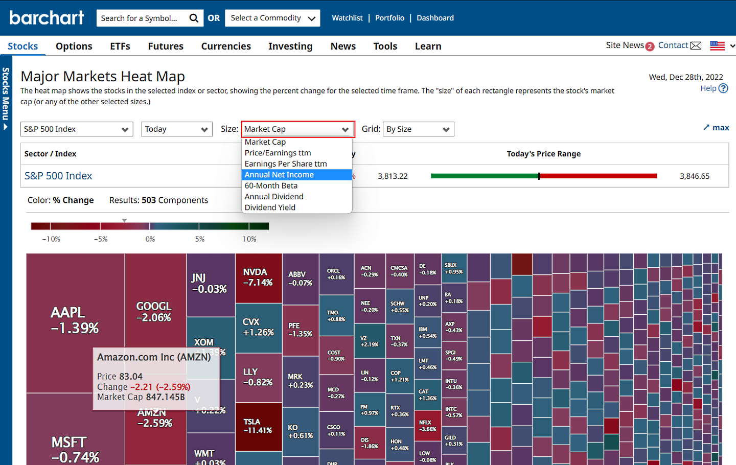
Stock Market Today Dow S P 500 Nasdaq Rise For Second Day In A Row Ea5f1c90 2217 11f1 Bd7f. Stock Market Heat Maps Top 8 Best Free Heatmaps Tested 2026 Stock Market Heatmap Tradingview . The Stock Market Maps Vivid Maps Stock Map 1024x594 . TradingView Stock Market Interactive Heatmap . Stock Market Heat Maps Top 8 Best Free Heatmaps Tested 2026 Stock Market Heatmap Barchart
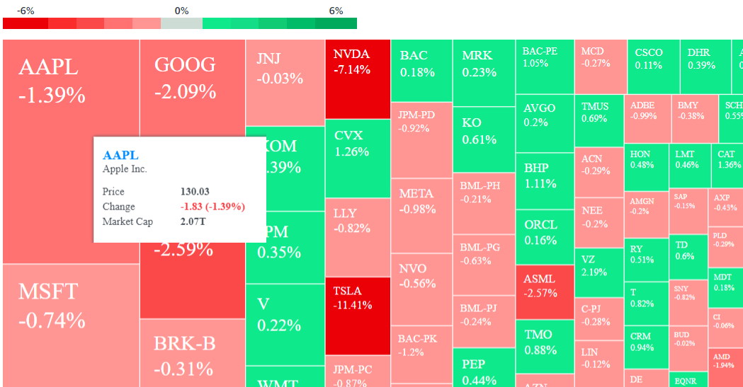


Stock Market Heat Maps Top 8 Best Free Heatmaps Tested 2026 Yahoo Stock Market Heatmap . 6 Heatmaps To Supercharge Your Trading In 2026 Real Time Heatmaps Buy Sell Gauges Analyst Ratings In Tradingview 1024x564 . Heatmap Heatmap YouTube . Stock Market Heat Maps Top 8 Best Free Heatmaps Tested 2026 Stock Market Heatmap Stockrover . What Is Heat Map Analysis In Stock Market At James Velarde Blog Stock Heatmap Varying Block Sizes 1024x555


Stock Heat Map Excel At Brenda Bradley Blog YTD . How To Use Stock Heatmaps For Market Analysis Tips And When To Spot Trends Screenshot 2024 10 09 At 13.07.50 B82fb9 . Tech Giants And Lead Today S Stock Market Surge A Stock Heatmap By FinViz.com 2024 07 31T01 46 06 Id C4b8ff30 Fa00 4a0a 81e3 Size900 . Nifty Heat Map Live Nifty 50 Heat Map OQWCDG UoEgitXg Big . Stock Market Heat Maps S P 500 Heat Map ICDK

What Is A Heat Map For Stocks At Priscilla Scott Blog . Finviz Market Heat Map Mechanical Investing Motley Fool Community 2 1024x628 . Stock Heatmap Today 02 13 2024 Navigating The Market S Pulse Image 297 1024x652 . Stock Market Heat Maps Top 8 Best Free Heatmaps Tested 2026 Best Stock Market Heat Maps . The Good News 8 2 2024 The Greer Journal Stock Heat Map 8 2 2024

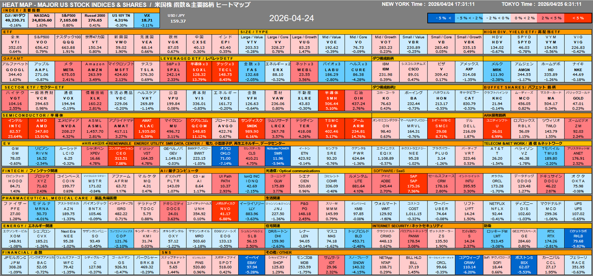


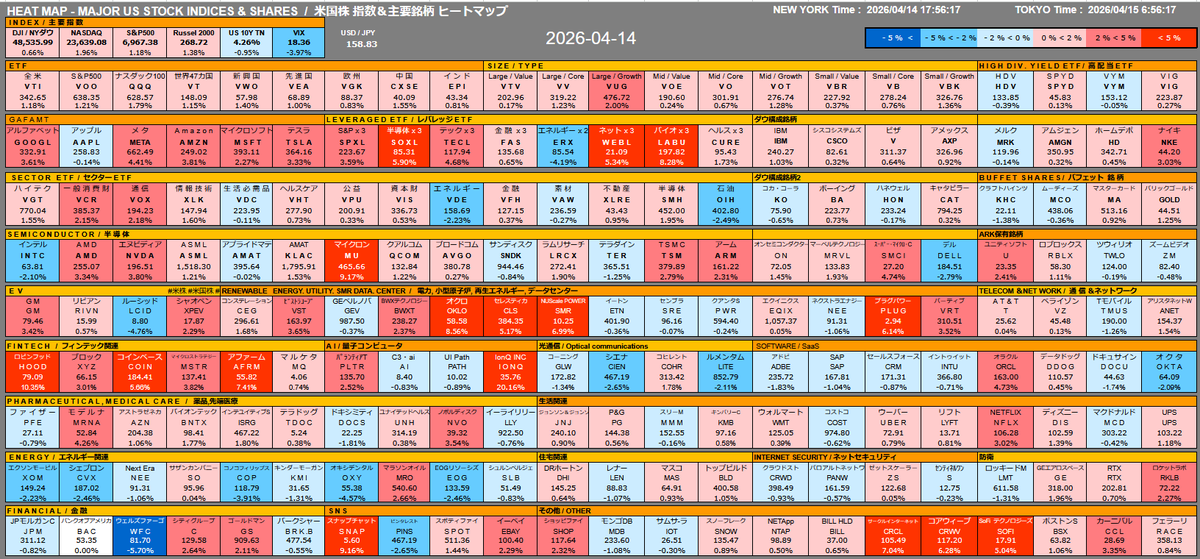
Worst Month For Stocks Is Near Heat Map 2023 08 30 . HEAT MAP US Major Index Stocks 2026 04 24 Moomoo . HEAT MAP US Major Index Stocks 2026 04 29 Moomoo . Stock Market Today Dow S P 500 Nasdaq Slip Oil Surges As Middle Meme Stocks 5 4 2026 9485 . HEAT MAP US Major Index Stocks 2026 04 14 Moomoo


Tech Stocks Surge Meta And Microsoft Lead The Charge In A Mixed Market Stock Heatmap By FinViz.com 2025 07 31T02 46 13 Id 37f9c8e8 E014 449e Ae7b Size900 . Nasdaq Heat Map Nasdaq 100 Forecast 2024 PrimaNYC Com . 6 Heatmaps To Supercharge Your Trading In 2026 Powerful Heatmaps By Trendspider 1068x689 . Software Stocks Are Finally Joining The Tech Rally 15d547c0 380f 11f1 Bdc5. Stock Market Today Dow S P 500 Slip For Second Day Oil Jumps As Iran Dd381140 1d7e 11f1 B2de